The context
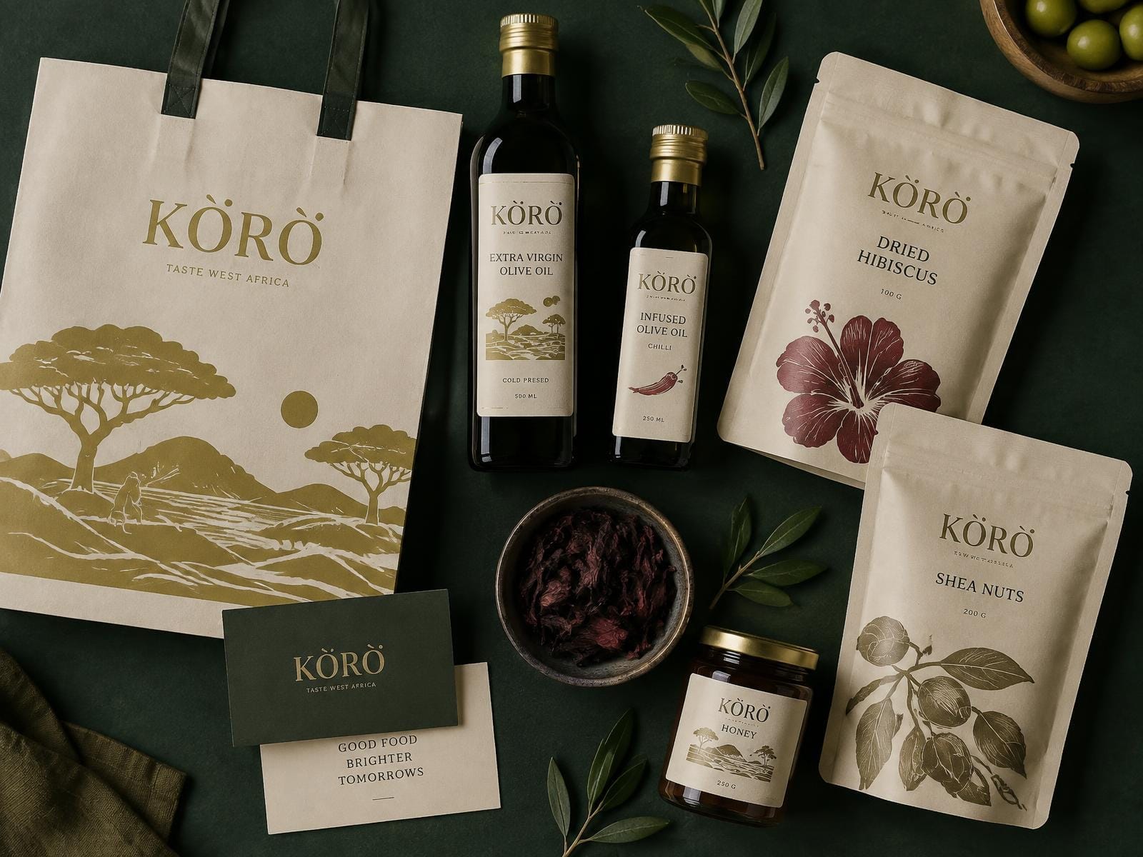
Kòrò had spent six years building a trusted supply chain for shea, hibiscus, honey and cold-pressed oils. Buyers in Lagos and Paris loved the product and hesitated at the shelf. Nothing about the packaging suggested the standard inside the jar.
The challenge
The brand needed to read as premium to an export buyer without losing the warmth that made it loved locally. Every earlier attempt had drifted into either generic minimalism or heavy-handed pattern work.
The execution
We built an identity around a single engraved landscape motif, a restrained gold-on-cream palette, and a typographic system disciplined enough to survive twelve SKUs. Packaging, market stall signage and the wholesale deck all draw from one kit.
What we delivered
- —Primary and secondary logo suite
- —Twelve-SKU packaging system
- —Illustrated motif library
- —42-page brand guide
- —Wholesale and retail collateral
Services
Brand strategyNaming architectureIdentity systemPackaging designBrand guidelines